fbpx
x
Blog
Search - RSTickets! Pro Knowledgebase
Search - Categories
Search - Contacts
Pages
Search - News Feeds
Search - Tags
CLOSE

Dogma Kills Design

By

It’s all in the title, really.

I am no stranger to dogmatic thinking. I was once a very religious missionary, and currently am an open source enthusiast, a web designer, and a gamer. Of all the dogmatic thinkers I’ve encountered in each of those fields, I’m not actually sure which scare me the most. Some are easily identified from a distance, but you never know who compiles their own UNIX-based OS from scratch until it’s too late.

We want to make amazing things, and/or a lot of money, and we often end up fixating rather rigidly on whatever we believe will achieve those goals

No, it’s not a one-to-one comparison, but bear with me here. I’m not saying anyone is likely to be purged in the name of free software, or because they’re on the wrong side of the Warframe vs. Anthem debate. But… it’s not completely outside the realm of possibility. Human beings in general can get a bit intense on occasion.

That’s what (I believe) dogma is, in our modern context: intense and very rigid thinking. Creative people are people of passion and drive. We want to make amazing things, and/or a lot of money, and we often end up fixating rather rigidly on whatever we believe will achieve those goals. Creative though we may be, we are not immune to the universal laws of irony.

Read more
  2279 Hits
  0 Comments
2279 Hits
0 Comments

3 Essential Design Trends, March 2019

By

Typography, color and distinct layouts are all elements that contribute to any design project. They are also elements of design that can trend over time.

That’s exactly what we are seeing this month as bold design elements are just the things that are making certain website designs come to the forefront. Here’s what’s trending in design in this month.


Bold Sans-Serifs

Big, thick lettering can draw attention and tell a story. And that’s just what designers are doing with the use of more bold, thick sans-serifs in projects.

Thicker letterforms are a good choice for reverse typography or in situations where there is a lot going on to compete with the words. The challenge is that bold typography can be a little overwhelming when there’s a lot of it to read.

Read more
  2240 Hits
  0 Comments
2240 Hits
0 Comments

Popular Design News of the Week: February 18, 2019 – February 24, 2019

By

Every week users submit a lot of interesting stuff on our sister site Webdesigner News, highlighting great content from around the web that can be of interest to web designers. 

The best way to keep track of all the great stories and news being posted is simply to check out the Webdesigner News site, however, in case you missed some here’s a quick and useful compilation of the most popular designer news that we curated from the past week.

Note that this is only a very small selection of the links that were posted, so don’t miss out and subscribe to our newsletter and follow the site daily for all the news.


Visualize a Website


Read more
  2433 Hits
  0 Comments
2433 Hits
0 Comments

15 Critical Website Fixes to Make Before Launching a Mobile App

By

Your target market has gone mobile. Mobile users spend up to 12% of their time browsing on their device, which works out to 87 hours a month or 1,044 hours a year spent on their phone; 90% of that time is spent using mobile apps.

Which is why having a mobile app can be so valuable for your business. No wonder everyone seems to be jumping on the bandwagon. Even 67% of small businesses now have a mobile app.

The problem is, many apps are just awful extensions of already bad websites. While you might feel the urge to dive straight into developing your own and racing it to the market, it’s a huge mistake. Mobile apps are a gateway to your site. So trying to implement them without some critical website optimization can directly impact the amount of time and money it takes to create the app.

Here are 15 website tweaks you should make before considering a mobile app.


Read more

Blog fields

  • 5 minutes
  4549 Hits
  0 Comments
4549 Hits
0 Comments

19 Contemporary Font Pairings for 2019

By

Typography is a fundamental part of design, it enables the designer to create a variety of moods and effects by using various font styles.

There are thousands of different styles available, so the task of finding the correct one to suit your project can often appear very difficult.

There are numerous tools online that offer assistance in selecting the correct font pairings. Here’s one we built ourselves. Using this handy font combination tool we have compiled a list of 19 contemporary font pairings for 2019. All of these fonts can be downloaded for free from Google Fonts.


1. Playfair Display with Source Sans Pro

This would have to be our top font combination for 2019. With it’s more traditional style, Playfair Display is both elegant and unique; it was designed by Claus Eggers Sorense, and can be paired with a variety of simple fonts, however, we think that Source Sans Pro is a perfect match, its thin lines and simple text make it a perfect combination for the more stylish Playfair Display.

Read more
  3041 Hits
  0 Comments
3041 Hits
0 Comments

Interview: Jorn and Koen of Framer X

By

The holy grail of web design used to be a three-column layout where every column had equal height. Now, the holy grail is making it so anyone can design a website or app. Visual design apps abound, one of the big names in the Mac community right now is Framer X.

Framer X isn’t staying on only the Mac platform, though. The team has big plans, and it involves more than making it easier to push pixels. They reached out to WDD to see if we wanted to get a sneak peek of what’s coming next, and since I am one of the resident app nerds, I had the pleasure of interviewing them.

WDD: Tell us about yourselves.

Framer: So Jorn and I (Koen) worked at our first company, Sofa, together in 2009. Things really took off after we won a few Apple Design Awards, when we got a call from Mark Zuckerberg. The rest is history, as they say — our company and team were acquired by Facebook in 2011, where we ended up doubling their product design team.

We spent two years there helping launch some major product features but eventually moved back to Amsterdam and co-founded Framer in 2013. It’s been both challenging and extremely rewarding to stick to our guns and build this company in the Netherlands, even raising our Series B last year.

Read more
  2445 Hits
  0 Comments
2445 Hits
0 Comments

What’s New for Designers, February 2019

By

Get ready to create a new list of bookmarks! The new tools featured this month are perfect for saving; some of them you’ll want to come back to over and over, such as a security checklist, cool background maker and a season-specific typeface.

If we’ve missed something that you think should have been on the list, let us know in the comments. And if you know of a new app or resource that should be featured next month, tweet it to @carriecousins to be considered!


DiceBear Avatars

DiceBear Avatars allows you to create placeholder avatars in cool block style. You can create characters or identicons using the free HTTP API.


Read more
  3240 Hits
  0 Comments
3240 Hits
0 Comments
Featured 

Popular Design News of the Week: February 11, 2019 – February 17, 2019

By

Every week users submit a lot of interesting stuff on our sister site Webdesigner News, highlighting great content from around the web that can be of interest to web designers. 

The best way to keep track of all the great stories and news being posted is simply to check out the Webdesigner News site, however, in case you missed some here’s a quick and useful compilation of the most popular designer news that we curated from the past week.

Note that this is only a very small selection of the links that were posted, so don’t miss out and subscribe to our newsletter and follow the site daily for all the news.


Introducing Textblock


Read more

Blog fields

  • 5 minutes
  • Every week users submit a lot of interesting stuff on our sister site Webdesigner News, highlighting great content from around the web that can be of interest to web designers.

  • Popular Design News of the Week: February 11, 2019 – February 17, 2019
  2453 Hits
  0 Comments
2453 Hits
0 Comments

React JS SEO Guide – Getting Started With React Server-Side Rendering

By
​ According to reports, approximately 92 percent of the web traffic comes from the first page of the search engine results while about 75 percent of traffic goes to the first five websites on the result. These figures show us how important SEO is for any business. Today, search engines depend on crawling the content on the websites. As the process ...
Read more

Blog fields

  • 15 minutes
  • Today, we see the different issues faced by websites running on React JS and consider the solutions that help deal with the problems for better SEO and website visibility.
  • React JS SEO Guide – Getting Started With React Server-Side Rendering
  4891 Hits
  0 Comments
4891 Hits
0 Comments
Featured 

8 Secrets of the Perfect Link

By

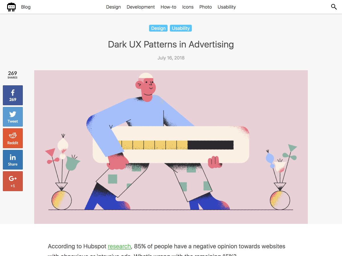
A few weeks ago a frustrated face appeared around the corner of my desk. “Sorry mate, you don’t do any printing do you?”

“Well yeah, sometimes,” I said.

I have a dedicated desk in a co-working space, we share a printer, and it was this shared printer that was frustrating the face in question: “I’ve been trying for hours to get this bloody thing printed, I’m absolutely desperate, I can’t find the right driver anywhere…”

“I think you just log into the dashboard and download it,” I said. “I think that’s what I did, hold on let me try,” I said, firing up the office dashboard. “You go to printer instructions…”

“Yep, I did that.”

“…and then you click…”

“Oh God!” he wailed. “It’s a link isn’t it.”

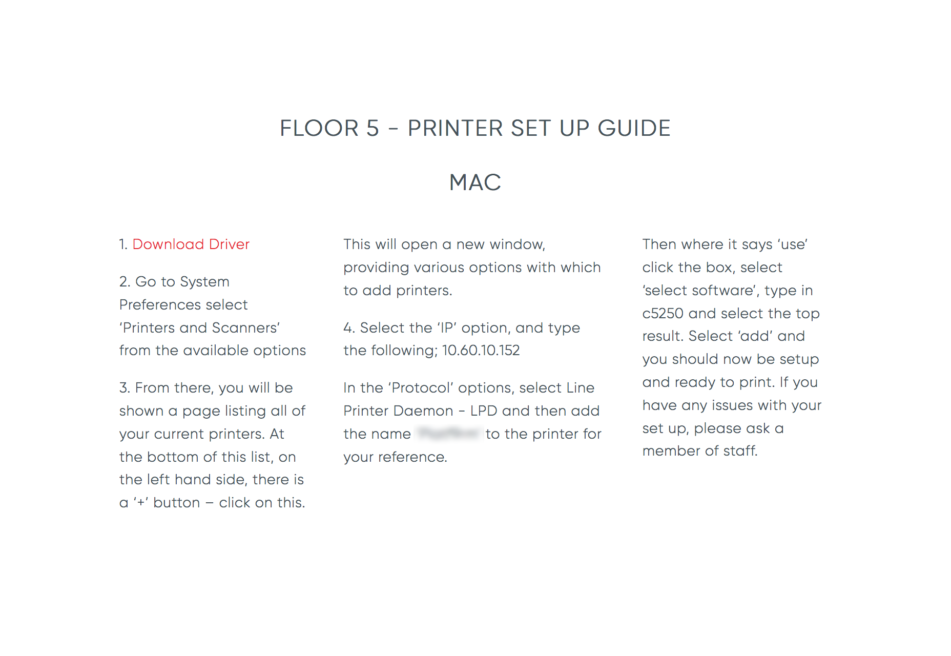
Here are the instructions that he’d been struggling with:

printer_instructions

An intelligent, professional person, had spent two hours searching for the right driver for a Canon printer, never realizing that the “Download Driver” instruction was a link.

As he slunk back to his workspace, it seemed impolite to enquire as to whether or not he’s color blind, but I’d put good money on it; if he is, that link probably appears mid-grey, blending in with the rest of the text.

Links are arguably the most important element in any document. Without them, the web is just a collection of files stored on the Internet. The perfect link is simple, honest, and usable. Here’s how to design it.


1. A Good Link is Not a Button

…and a good button is not a link.

We frequently misunderstand the role of links on the web. A link describes the relationship between two pieces of data, providing context, and often providing meaning.

Buttons perform actions, links form contextual relationships

A link does not perform an action. The printer driver link above should not be a link, it should be a button; buttons don’t link data, they perform an action.

It’s entirely true that the vast majority of GUIs allow you to tap or click a link in order to access the linked data, but that is simply a shortcut. The primary role of the link is to establish a connection between pieces of data.

Buttons perform actions, links form contextual relationships.


2. A Good Link Clarifies its Purpose

Central to the problem of how a link should be used, is the fact that the anchor element is flexible enough to be used in a number of ways without breaking. A mailto: link for example should not be a link (it’s an action, not a connection between pieces of data) that has escaped deprecation by being really very useful.

We have a whole hierarchy of headings—including the relatively useless <h5></h5> and <h6></h6>—but we have a single anchor element. In an ideal world we’d have multiple anchor elements to give semantic meaning to links, perhaps a <ae></ae> element for external links (data on a different domain) and a <ai></ai> for internal links (data on the same domain). At present the nearest we can get to giving links semantic meaning is using absolute paths for external links and relative paths for internal links.

We can of course apply different styles to different classes of anchor using CSS. It makes sense that to clarify purpose, internal links should be styled in-keeping with the site’s brand, but that external links should be distinct in some way.

In Tim Berners-Lee’s 1997 thoughts on the nature of UI, he states that:

the interface to a universal space should have a certain universal consistency

Certainly users’ understanding of how to use the web has developed since those words were written, but the essential point holds true; users prefer a UI that reflects their wider experience. While there is an argument to say that internal links should be in-keeping with a site’s brand to clarify what they link to, there is an equally valid argument that adhering to the default styles—blue, underlined, system fonts—for external links, not only simplifies an interface, but clarifies that the data being linked to is outwith the current site’s domain.

Whether inconsistency of links causes more confusion than it relieves should be addressed on a case-by-case basis. But in cases where internal links and external links are styled the same, in the interests of usability, it’s the familiar blue, underlined, system font approach that best serves the user.


3. A Good Link is Visited

Thanks to William Gibson-esque metaphors, we have a tendency to conceptualize surfing the web as traveling to different locations. Links are viewed as a gateway to somewhere else, when in fact they are a gateway to somewhen else. Take a look at your browser history. It’s not a map of locations, but a chronological record of events. Links are points in the timeline of our data consumption.

visited links are the low-hanging fruit of UI design

As important as links to future data, are links to past data: visited links. Visited links are important because it is visited links that contextualize our data consumption and highlight (by their elimination) that data that we have yet to consume.

Visited links can be a little crude—ideally a link would be compared against a user’s browser history to determine not just if the document had been visited, but if the document had been updated since the user’s last visit. Despite this, visited links are the low-hanging fruit of UI design—easily styled as a slightly desaturated, less urgent version of an active link—and provide invaluable information to the user about their experience.


4a. A Good Link is Always Blue

The principle formalized by psychology as the Mere Exposure Effect teaches us that the more familiar something is, the more appealing it is.

The default color of a hyperlink in a browser, is blue. Hyperlinks appear to have been established as blue by sheer chance (presumably someone somewhere’s personal preference). The fortuitous decision benefits usability because almost no one has a blue sight deficiency; unlike red and green, we can nearly all see blue.

Whether a learned behavior, or an inherently more usable color, blue links are clicked more.

(Because of this deep association, no text should ever be blue unless it’s a link.)


4b. A Good Link is Rarely Blue

Blue is the most popular color across the board. Blue is also the most common color in UI design, especially among technology and news sites.

The omnipresence of blue raises a challenge for designers: if the primary brand color is blue, should the links in the document also be blue, or does the use of blue in the general design obfuscate the location of links?

Whenever designing with a lot of blue, I’ve found users prefer complementary colors for links; orange, or green for example. However, with the proven effectiveness of blue links, it’s worth edging towards the blue end of the spectrum: reds should edge towards purple, greens towards turquoise.


5. A Good Link is Underlined

The argument for underlining is that, as with the printer driver example, underlining reinforces the color indicator; if a person is color blind, they can still see the underline.

The argument against underlining is that it interrupts the flow of text. Google removed underlined links years ago with no apparent downside—at least not enough of a downside to cause them to reverse the decision. But then Google’s links are blue, the linkiest of all link colors, and less of a problem for the color blind.

If underlining text is genuinely too disruptive, there are two simple alternatives: you can either style a pseudo-underline by applying a dashed or dotted bottom-border to the link which will be visually less impactful, or you can highlight in a different way, such as applying a background color to the link.

(As with the avoidance of blue text, never underline text that isn’t a link; users will conclude that your link is broken long before they realize you made a poor design decision.)


6. A Good Link Stands Out

Links should be identifiable at a glance. Interaction is inconsistent across devices, and relying on scrubbing the page to uncover links is a recipe for user frustration.

Links should be identifiable at a glance

Eye-tracking research suggests that users scan through links, just after titles, to identify the parts of the page most interesting to them. This ability is even more important for screen reader users, who can’t visually scan a page for relevant content, but can (and do) scan through links to identify interesting content.

When treated as bullet points, links describe not only the data that they link to, but the content in which they sit. You wouldn’t link to information on perfume from a paragraph on mountain bikes, so it’s common sense that if there’s a link to mountain bikes, then the paragraph in which it resides will also be about mountain bikes.


7. A Good Link Uses Good Microcopy

If possible, keep links at the end of sentences, or the end of blocks of text; this limits the interruption to the thought process, and creates a less disjointed experience. However, never employ the “more information…” approach.

Running a search on Google for “click here” returns 5,090,000,000 results. A similar search for “read more” returns 17,090,000,000 results. What a waste.

Beyond the evident SEO failures of “read more”, “find out more”, “click here” etc. poorly written links give the impression that the current content is abdicating its authority. You are in effect saying, “this information is shallow, there’s better information elsewhere.”

If a link is designed well enough, it is clear at a glance that it’s a link, and “click here” style instructions are superfluous.


8. A Good Link Facilitates Good UX

It’s essential that links can be easily triggered, regardless of the delivery device; mobile sites need large enough hit areas, speech readers need distinct microcopy.

A link must always keep its promise

Links should follow the reasoned approach of the majority of use-cases. That means that internal links open in the same window, and external links open in a new tab. There are exceptions, a link to a privacy policy for example is an internal link but should be opened in a new tab. Whenever making this choice, ask yourself if the user is likely to need the back button. If so, use a new tab so it can be easily closed returning the user to the previous information.

No link should ever surprise a user, and that includes the type of content you’re linking to. If you’re linking to content that is NSFW, or behind a firewall, consider using the :before or :after pseudo elements to insert an icon next to the link, warning the user of what’s coming.

A link must always keep its promise. That means that when a user clicks, taps, selects, or otherwise triggers a link, they get exactly what they were expecting. And that includes ensuring that links are never, ever broken.

Read more

Blog fields

  • 5 minutes
  • Links are arguably the most important element in any document. Without them, the web is just a collection of files stored on the Internet. The perfect link is simple, honest, and usable. Here’s how to design it.

  3096 Hits
  0 Comments
3096 Hits
0 Comments

20 Freshest Web Designs, July 2018

By

Welcome to our roundup of the best websites launched (or significantly updated) this month. July is a strange time to launch a site with the Summer slowdown in full effect, but these intrepid entrepreneurs have done so. We’ve got examples of great ecommerce, a couple of agency sites that we couldn’t resist, and lots of incredible art direction.

This month sees a big trend in compass navigation (a link in every corner of the page), and parallax is definitely still a big deal. Whether it’s inspired by the World Cup, or Le Tour, there’s a subtle gallic feel to a lot of sites this month…savourer!


Drift

Drift is a creative agency with some chops. Rejecting the minimalism that seemingly every other agency opts for, they’ve put together a charmingly animated, hand-made site. Not too functional, unless your aim is to communicate creative courage—they stand out.


Read more

Blog fields

  • 5 minutes
  • We’ve got examples of great ecommerce, a couple of agency sites that we couldn’t resist, and lots of incredible art direction
  3099 Hits
  0 Comments
3099 Hits
0 Comments

Popular Design News of the Week: July 16, 2018 – July 22, 2018

By

Every week users submit a lot of interesting stuff on our sister site Webdesigner News, highlighting great content from around the web that can be of interest to web designers.

The best way to keep track of all the great stories and news being posted is simply to check out the Webdesigner News site, however, in case you missed some here’s a quick and useful compilation of the most popular designer news that we curated from the past week.

Note that this is only a very small selection of the links that were posted, so don’t miss out and subscribe to our newsletter and follow the site daily for all the news.

Google Material Design: Updates, Improvements, and New Tools

CSS: A New Kind of JavaScript

The Importance of Brand Consistency

A Look at Chrome’s New Tab Design

Wheel

Dark UX Patterns In Advertising

Peoplzz – A Collaborative Hub for Company Culture Builders

New Netflix TV Interface

Listify – A Minimal Space for your To-dos, Tasks & Reminders

Handlescout – Get Notified When a Twitter Username Becomes Available

Tungsten: A Modern, Industrious Font

Cinematography in User Experience Design

12 Reasons Why You Need a Design Mentor

BuzzFeed Unveils a Sophisticated New Look

My UX Resource List

Twitter’s Bottom Navigation Bar is Official, Rolling Out to Everyone

Is Coding Becoming Obsolete?

ColorSpark for Sketch – Discover Unique Colors and Gradients Directly in Sketch

Teutonic CSS — a Modern CSS Framework with Style

SlickMap CSS: A Visual Sitemapping Tool for Web Developers

Font Playground

How One Typeface Took Over Movie Posters

Building the Google Photos Web UI

10 Do’s and Dont’s to Get the Most Out of your UX Design Portfolio

Why Bad Technology Dominates Our Lives, According to Don Norman

Want more? No problem! Keep track of top design news from around the web with Webdesigner News.

Read more

Blog fields

  • 5 minutes
  • test
  2384 Hits
  0 Comments
2384 Hits
0 Comments

Brainstorming the Wiki

By

Before the blog took off, before Tumblr became the face of fandom, but around a year after Geocities launched as a platform for Justin Timberlake fan sites, there was The Wiki. We looked upon The Wiki, and we saw its potential as a platform for crowdsourcing knowledge, collaborating, and educating. We saw that it was good.

Then Wikipedia was founded at some point, and the rest is history.

I love well-maintained wikis to a fault. Wikis have been a large part of my continuing education in web design, random trivia, and the minutiae of video game mechanics for a long time, now. Anyone who learns stuff on the Internet owes a lot, directly or indirectly, to wikis and their less-community-oriented cousin The Knowledge Base.

Even though many of the publicly available wiki software options are dated and confusing to operate and organize, they continue to power much of the educational portion of the web. There are more modern options, but most of the ones I’ve found are SAAS platforms for building in-organization private wikis.

Ladies and Gentlemen, wikis and knowledge bases need all the love we can give. That’s what this article is about: brainstorming ways to give back to the platforms that have given us so much. I’ve got some general ideas, and some very specific tweaks to the wiki formula that you might consider implementing on your own wikis, should you ever need to build one.

Read more

Blog fields

  • 5 minutes
  • Ladies and Gentlemen, wikis and knowledge bases need all the love we can give. That’s what this article is about: brainstorming ways to give back to the platforms that have given us so much. I’ve got some general ideas, and some very specific tweaks to the wiki formula that you might consider implementing on your own wikis, should you ever need to build one.

  2670 Hits
  0 Comments
2670 Hits
0 Comments

How to Tackle a Redesign

By

Stepping into a website that’s already well-established isn’t always easy. For starters, you have to be careful about not stepping on anyone’s toes (the client’s or even the previous designer’s) when providing feedback or suggestions on a new direction for the site. Secondly, there’s much more at stake with a redesign. Not only could a wrong turn hurt an established brand’s identity, but there’s also the disruption to SEO to consider.

That said, redesign projects can be incredibly rewarding. With from-scratch designs, there’s really no baseline to compare your work against. With a redesigned website, you can look back at the performance of the last iteration and compare it against what you’ve been able to accomplish.

If you’re intrigued by the prospect of tackling a redesign project, but spooked by the potential to do damage or get lost in the process, this guide breaks down what you need to do.

Phase 1: Ask Why

When approached with a redesign request, the first thing you should find out is, “Why?”

When it comes to redesigns, there are a number of reasons a client might be dissatisfied with the site as it stands:

Rebranding

Businesses don’t always maintain the same direction or goals. And sometimes a brand discovers its true identity after launch.

Asana’s branding story is an example of this. This is how their website and SaaS platform looked before:

Asana Before

As they explained, the true personality of the brand wasn’t effectively communicated through the logo, colors, and overall design. After assessing how they wanted their brand to be viewed, they pushed ahead with this redesign:

Asana After

Missing Functionality

When the site was originally designed, your client perhaps hadn’t considered that they would need some key functionality for it.

Outdated Design

Design trends change so much in such a short amount of time. Clients that are cognizant of these changing trends may approach you if they feel their site is being left behind.

Not Responsive

The original designer failed to anticipate the move to mobile-first and now your client is in a bad spot. The Deep End’s case study demonstrates how even the most technologically savvy of agencies could have missed this opportunity. But they were quick to remedy the problem:

The Deep End Before and After

Conversions Suck

They were initially excited about the launch of their website. Then, a month passes. A few more months pass. And, soon, a year has gone by and they have seen no results from it. They want to know what’s wrong and get it fixed immediately.

Be sure to get them to explain how they believe this redesign will help them achieve the website’s goals (and define exactly what those are, too).

Phase 2: Check the Data

Your client tells you what the perceived problem is with their site. Now, you need to dig into the data to see if it checks out. The client may be unhappy with a certain aspect of the site or the design as a whole. Their intuition is likely right, but you have to verify that the problem doesn’t lie somewhere else.

During this phase, dig deep into the following areas:

Google Analytics Competitive landscape Keyword research UI design UX organization

Then, look at the entire website. Every. Single. Page. Do a full audit of what they have.

From this, you should be able to draw a conclusion about the true problem areas. Are there too many pages? Is the design misrepresenting what they do? Does the font need a refresh? Is there a key feature missing? Are images outdated or unoriginal looking? Build your redesign proposal from this and bring it to the client.

Phase 3: Devise a Plan

If you’ve never done a redesign project before, use the project workflow and checklists from your standard design projects. Review the steps and milestones against what you need to do in this redesign. Then, amend the steps, establish new milestones, and shape the redesign plan.

The tricky thing about this is that each redesign project will target different elements of a web design, which means adjusting your workflow from project to project. For instance, the redesign might only target:

Branding like the logo, color palette, typography, imagery, iconography, etc. in which case, it might only be a superficial redesign; Navigation structure for improved user flow or a complete breakdown of the navigation to remove unnecessary pages; Home page content for clearer messaging and user persona targeting; Customer flow which was preventing the brand from capturing more conversions.

It’s not as if you don’t have experience with each of these elements. However, it’s the manner in which you work on each or how many of them you work on that will differ from a traditional web design. So, create your documentation, but leave it open to adjustment per the project’s requirements.

Phase 4: Implement the Redesign

Unless the website was a complete mess or total failure previously, chances are good your client will ask you to be careful in how dramatically you alter the design and content. To preserve the business’s integrity, you’ll have to strike a balance between creating a stronger identity for the brand while not completely destroying all recognition they’ve established with customers.

Site maps, storyboards, and prototypes should all factor into your process now (if they hadn’t already). These tools give you a chance to tackle the redesign in incremental steps and to check in with the client before moving on. You might even want to think about running A/B tests on the live website to confirm theories you have about problematic elements before implementing anything in the redesign.

Also, don’t forget how these changes will affect SEO. Unless the site is moving to a completely new domain, you will have to do what you can to preserve link juice. This means putting 301 redirects in place, maintaining the URL structures for the most popular pages and posts, putting a greater focus on the most successful keywords, and so on.

Should You Accept That Redesign Request?

I see no reason why you shouldn’t start accepting redesign requests, especially if you appreciate the problem-solving aspect of the work. That’s, of course, not to say you can’t flex your creative muscle here, but this sort of work will definitely appeal to those of you who like to strategize and test theories in design.

Read more

Blog fields

  • 5 minutes
  • test
  2446 Hits
  0 Comments
2446 Hits
0 Comments

Popular Design News of the Week: June 25, 2018 – July 1, 2018

By

Every week users submit a lot of interesting stuff on our sister site Webdesigner News, highlighting great content from around the web that can be of interest to web designers.

The best way to keep track of all the great stories and news being posted is simply to check out the Webdesigner News site, however, in case you missed some here’s a quick and useful compilation of the most popular designer news that we curated from the past week.

Note that this is only a very small selection of the links that were posted, so don’t miss out and subscribe to our newsletter and follow the site daily for all the news.

Stream UI Kit – A Beautiful Open Source Bootstrap 4 UI Kit

Read more
  223 Hits
  0 Comments
223 Hits
0 Comments
Our team can work as an extension of yours
Let's start a conversation.
Contact us
  Cron Job Starts